In designing online betting platforms, the use of visual language plays a crucial role in shaping user experience, particularly when it comes to emotional neutrality. Emotion-neutral visual language refers to the deliberate use of interface elements, colors, typography, and animations that do not provoke strong emotional responses, either positive or negative. The goal is to help users make decisions based on logic and clarity rather than being driven by excitement, fear, or other intense emotions that can interfere with rational judgment. This approach is particularly significant in betting contexts, where the stakes involve real financial outcomes and the potential for impulsive behavior is high.
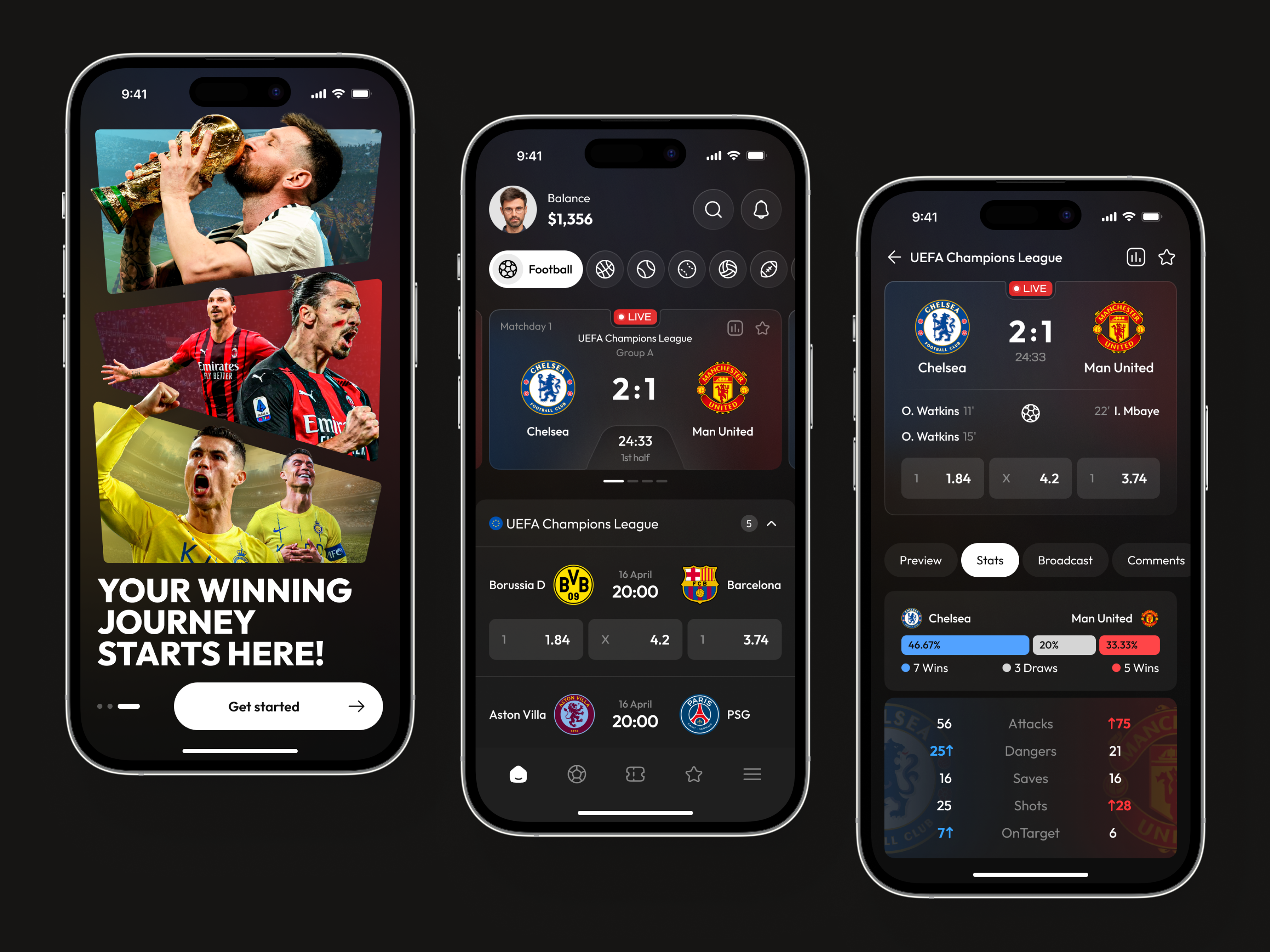
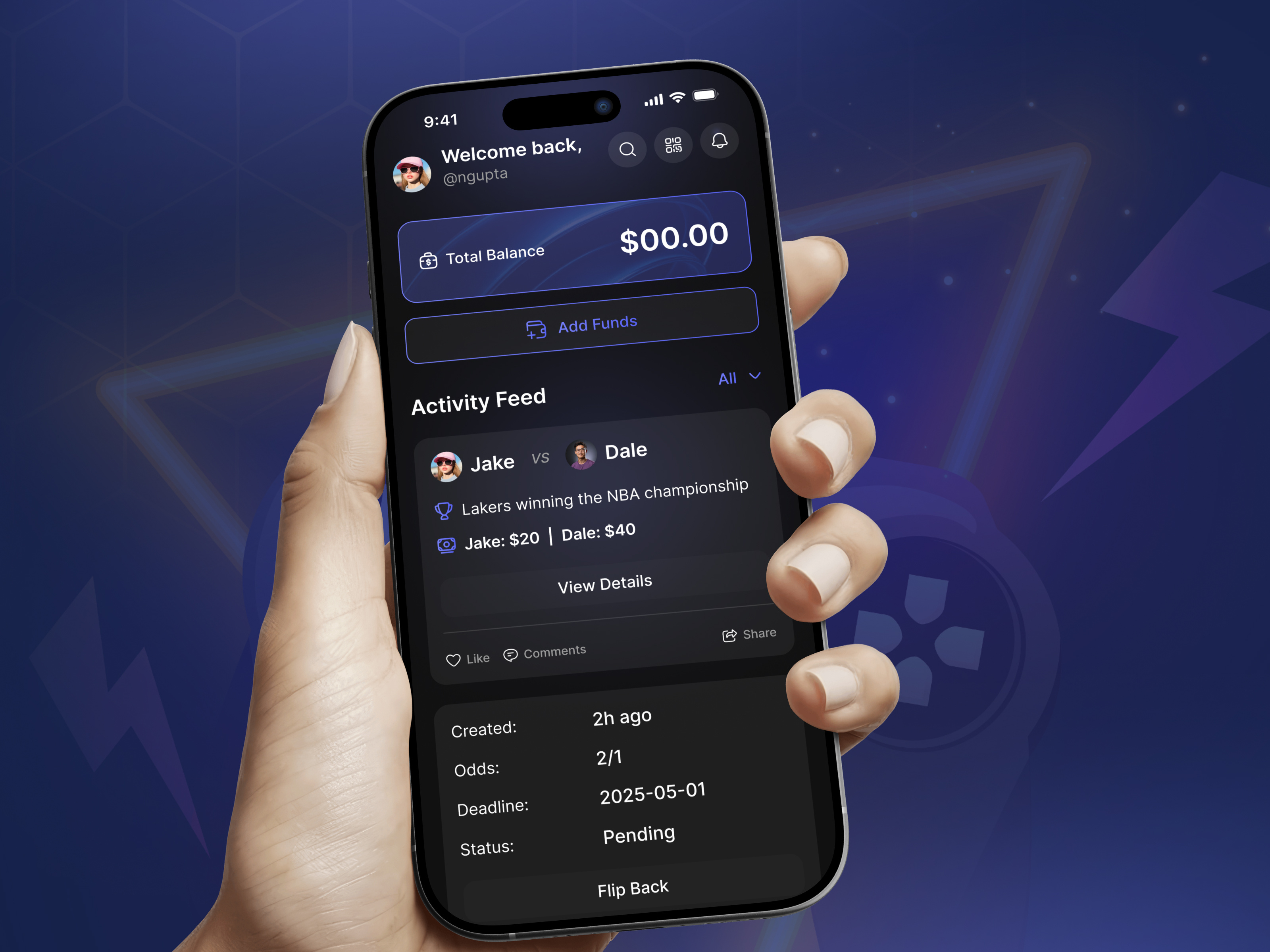
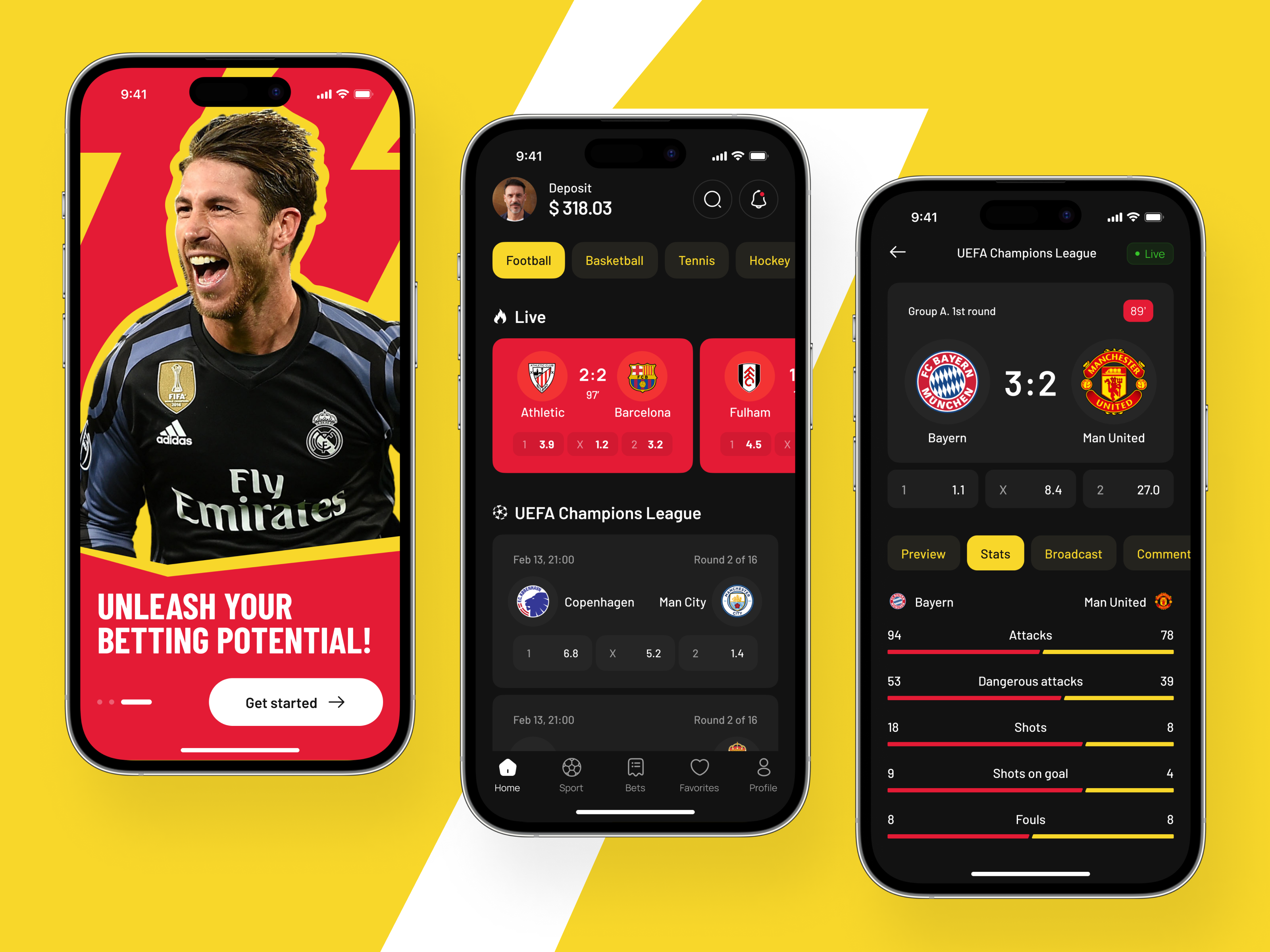
A primary consideration in creating emotion-neutral visual language is color selection. Colors inherently carry emotional associations; for example, bright reds can induce urgency or alertness, while vibrant yellows may trigger excitement or optimism. In a betting environment, such associations can influence player decisions, potentially encouraging riskier behavior. Therefore, designers often opt for muted, balanced tones, such as soft grays, cool blues, and gentle greens. These colors provide sufficient contrast to ensure readability and visual hierarchy without eliciting strong affective reactions. The careful application of these colors to key interface elements, such as buttons, odds displays, and notifications, maintains clarity while preserving emotional neutrality.
Typography also contributes significantly to maintaining a neutral emotional tone. Fonts with aggressive or highly stylized characteristics may inadvertently create a sense of excitement or urgency. Conversely, overly decorative typefaces can feel playful or informal, potentially undermining the perception of reliability. A clean, sans-serif typeface with consistent weight and spacing is often employed to convey professionalism and neutrality. Consistent typographic hierarchy ensures that users can easily differentiate between headings, subheadings, and body text, supporting a seamless comprehension of odds, potential returns, and betting options without emotional interference.
Beyond color and typography, the layout and structural organization of the platform must be designed to support calm and deliberate decision-making. Information should be presented in a clear, orderly manner, avoiding clutter or visual noise. Tables and grids can organize betting options efficiently, while sufficient spacing between interactive elements reduces cognitive load. Users can quickly scan the interface for relevant information without experiencing visual overstimulation. Consistency across pages and sections is essential; when users encounter predictable patterns and placements for odds, bet slips, and action buttons, their cognitive effort is reduced, allowing them to focus solely on evaluating betting choices rationally.
Animation and motion also require careful consideration. While animations can enhance user engagement, they can simultaneously introduce unintended emotional cues. Rapid flashing, bouncing, or pulsing elements can trigger excitement or a sense of urgency, potentially encouraging impulsive behavior. Instead, subtle and smooth transitions are favored. For instance, gentle fades when updating odds, slow slide-ins for menus, or soft hover effects for interactive elements provide visual feedback without amplifying emotional responses. The pacing of animations should align with the user’s natural reading and decision-making rhythm, reinforcing a sense of stability and control throughout the betting experience.
Iconography and symbolic language play another crucial role. Icons that suggest danger, reward, or urgency can provoke unintended emotional reactions. Instead, neutral symbols that clearly convey function without emotional connotation are preferred. For example, a simple check mark or circle to indicate selection, standard arrows for navigation, and universally recognized symbols for account, settings, and balance ensure that users understand actions without being influenced by affective cues. Similarly, any graphic representations of bets, outcomes, or odds should maintain neutral visual treatment—charts, graphs, or tables presented in balanced colors, clean lines, and proportional scaling support analytical thinking rather than emotional response.
Feedback mechanisms also benefit from emotion-neutral design. When a user places a bet, receives a confirmation, or encounters an error, the visual cues associated with these events should remain calm and informative. A green highlight for successful actions or a soft red for errors can convey necessary information without triggering strong emotional responses. The goal is to maintain a sense of reliability and trust, ensuring that users can process outcomes accurately without emotional distraction.
Furthermore, visual consistency across devices reinforces neutrality. Users accessing the platform on desktops, tablets, or mobile devices should encounter uniform color schemes, typography, and interface patterns. Discrepancies in visual language can create confusion or unintended emotional responses, undermining the sense of control and professionalism. Ensuring that the same emotion-neutral design principles are applied across all platforms allows users to form accurate mental models, supporting deliberate and informed betting decisions regardless of the device used.
Overall, emotion-neutral visual language is an essential strategy for responsible platform design in the betting industry. By carefully selecting colors, typography, layout structures, animations, and symbolic elements, designers can create an environment that supports rational decision-making, minimizes impulsive behavior, and promotes trust and reliability. This approach recognizes the psychological impact of visual stimuli, deliberately managing emotional influence to protect users and enhance the overall quality of the betting experience. Platforms that adopt these principles demonstrate a commitment not only to usability and accessibility but also to ethical responsibility, acknowledging that the interface itself can either exacerbate or mitigate the emotional pressures inherent in gambling.
In practice, emotion-neutral design encourages users to engage with the platform in a controlled, analytical manner. By reducing emotional triggers, users can focus on assessing odds, evaluating risks, and making informed choices, rather than reacting to excitement or fear. This design philosophy aligns with broader goals of responsible gambling, where the interface itself becomes a tool for fostering balance and clarity. Ultimately, emotion-neutral visual language contributes to a safer, more transparent, and professional betting environment, ensuring that user experience is driven by insight and understanding rather than uncontrolled emotional impulses.
The careful integration of these design elements—color, typography, layout, animation, iconography, feedback, and cross-device consistency—creates a cohesive and neutral visual language. This language serves as the foundation for an interface where users can interact confidently, make rational decisions, and maintain control over their betting behavior. By prioritizing emotional neutrality, platforms not only enhance usability but also promote ethical and responsible engagement, establishing a standard of practice that benefits both users and operators in the long term.



Be First to Comment